CASE STUDY 000 / VISUAL IDENTITY INDEPENDENT STUDIO · 2026

The idea behind
the mark .

A symbol for code and design. A track for momentum. An arrow for the journey from concept to completion.

THE MAKING OF CO-DE-SIGN ↘
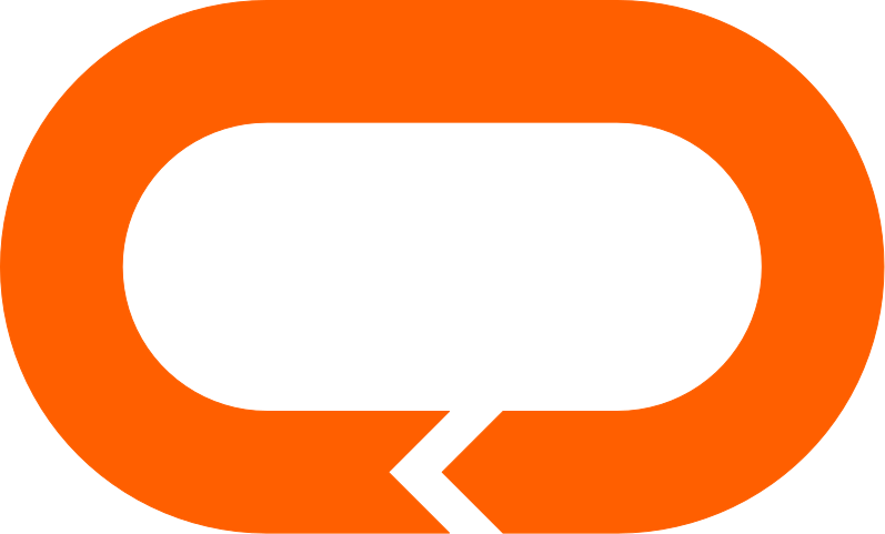
Current final CO-DE-SIGN mark: electric-orange oval loop with the arrow positioned on the lower section
01 / THE FINAL SYMBOL ORIGINAL VECTOR · DESIGNED IN FIGMA

A lot of ideas.
One direction.

CO-DE-SIGN began with a simple ambition: build an identity broad enough to hold consultancy, architecture, software development, and photography without feeling fragmented.

Rather than choosing an obvious icon for any one discipline, the goal was to create a geometric symbol with a story of its own: a relationship between the letters C and D, a continuous route, and purposeful forward motion.

More than
an oval.

The mark is designed to carry multiple interpretations. They are part of the intention behind the design—not details every viewer has to recognize immediately.

01 / FORM

C + D

Two disciplines—and a wider multidisciplinary practice—brought into one continuous monogram.

02 / DIRECTION

→

The arrow stands for movement, decision-making, and guiding an idea toward a finished result.

03 / MOMENTUM

∞

The racetrack-like loop reflects progress, iteration, determination, and the work of going the distance.

04 / PROMISE

100%

The same symbol translates into a clockwise loading animation, making the brand's process visible on the website.

Design is
iteration.

These are real versions from the design process, not retrospective sketches. Each explored a different balance of direction, complexity, and form.

First CO-DE-SIGN oval concept with thin black outlines and a single arrow notch
EARLY CONCEPT / 01
FIRST IDEA / THE LOOP

Find the language.

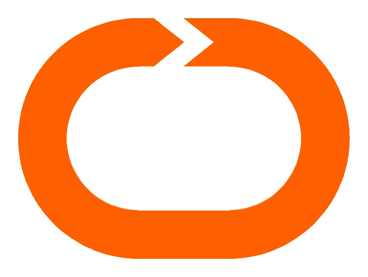
The first design joined an oval track with a forward-pointing chevron. The C/D concept, sense of momentum, and start-to-finish story were already there.

NEXT → CLEANER GEOMETRY AND MORE INTENTIONAL EDGES
Second version with an additional opposing arrow notch at the bottom of the oval
EXPLORATION / 02
TEST / DOUBLE DIRECTION

Explore the cycle.

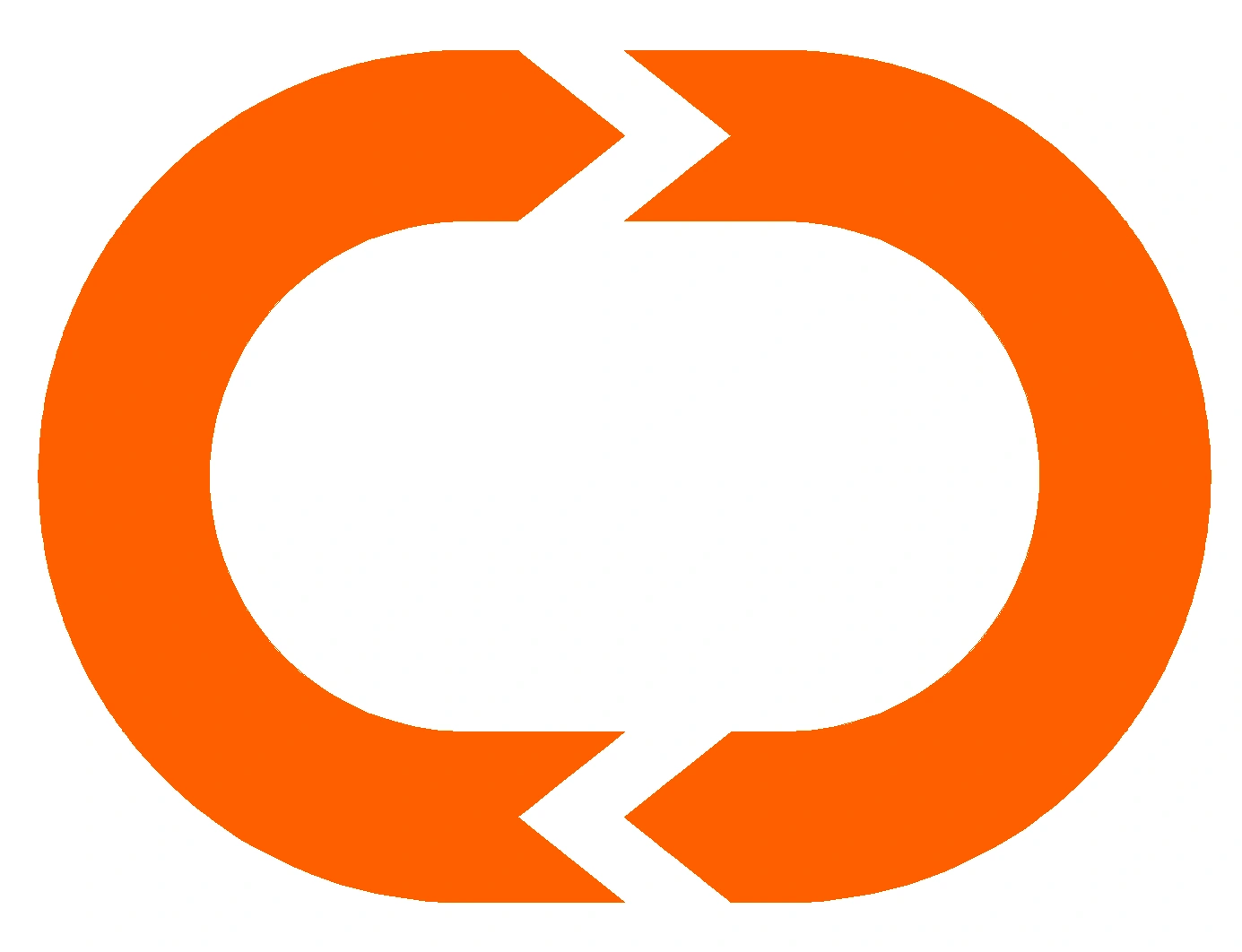
A second arrow introduced symmetry and the idea of feedback and continuous improvement. But it also made the form busier and competed with the main directional story.

NEXT → RETURN TO ONE CLEAR DIRECTION

Simplified oval with a single upper chevron notch and a thicker continuous orange band
REFINEMENT / 03
REFINEMENT / SINGLE ARROW

Remove the noise.

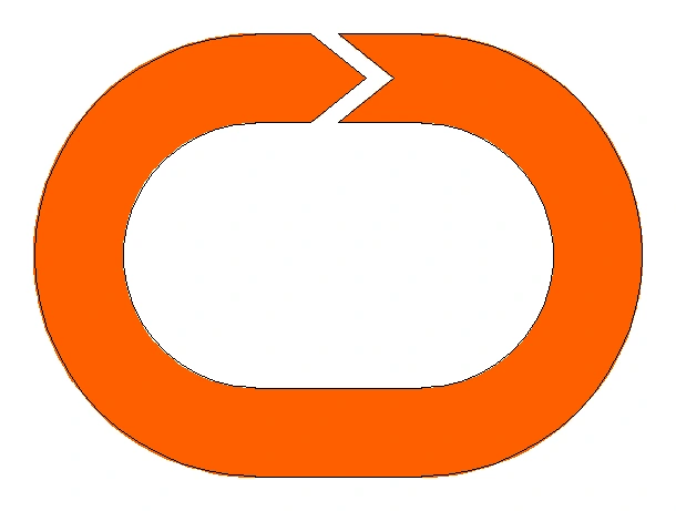
The single upper arrow returned. With the lower cut gone, the symbol became simpler, calmer, and more focused on forward motion.

NEXT → BALANCE THE CURVES, BAND, AND NEGATIVE SPACE

Refined.
Not reinvented.

Option B kept the idea intact while bringing the proportions into balance: smoother curves, a more deliberate arrow junction, carefully considered negative space, and the latest arrow position on the lower section so the motion resolves at completion.

The final symbol is recognizable at different scales and remains legible without decorative effects.

#FF5F00 ELECTRIC ORANGE #171717 CHARCOAL #F5F3EE WARM WHITE

The mark
in motion.

That racetrack idea became part of the actual website. On the first visit, the logo reveals itself clockwise, beginning and resolving at the lower arrow junction, with an arrow-shaped leading edge and a 0–100% counter.

CO-DE-SIGN logo shown on a charcoal background using the latest lower-arrow version 100%

FROM CONCEPT TO COMPLETION.

EXPERIENCE THE ANIMATION

More than
a logo.

The identity now lives as a vector mark, an animated introduction, a responsive website, and a growing portfolio. The project is an example of the practice it represents: exploring a concept, making deliberate design decisions, developing it into something usable, and refining it in the real world.

BACK TO SELECTED WORK